Visualize ordination
Introduction
In the ordination section, biplots were generated with the users color-coded by their Diet. However, they can also be color-coded individually. In addition, specific users can be highlighted with a thicker outline if desired. All of these can be done by loading the saved ordination results - Axis values and metadata combined, and the proportion of variance explained.
Load functions and packages
Name the path to DietR directory where input files are pulled.
main_wd <- "~/GitHub/DietR"Load the necessary packages.
library(ggplot2)Load the necessary functions.
source("lib/specify_data_dir.R")
source("lib/ggplot2themes.R")
Call color palette.
distinct100colors <- readRDS("lib/distinct100colors.rda")You can come back to the main directory by:
setwd(main_wd)Load ordination results - whether weighted or unweighted Unifrac distance results
Specify the directory where the data is.
SpecifyDataDirectory(directory.name= "eg_data/VVKAJ/Ordination/")Read in the metadata and users’ Axis values.
meta_usersdf <- read.table("VVKAJ_Items_f_id_s_m_QCed_4Lv_ord_WEIGHTED_meta_users.txt", header=T)Read in the eigenvalues for axis labels of biplots.
eigen_loaded <- read.table("VVKAJ_Items_f_id_s_m_QCed_4Lv_ord_WEIGHTED_eigen_percent.txt", header=T)Make a vector that contains the variance explained.
eigen_loaded_vec <- eigen_loaded[, 2]Plot Axis 1 and Axis 2
Show the separation of individuals colored by UserName
Create a folder called “Viz_Ordination” to save the plots to be produced here.
Color-code by UserName.
by_user <- ggplot(meta_usersdf, aes(x=Axis.1, y=Axis.2, fill=UserName)) +
            geom_point(shape=21, aes(color= UserName), size=3, color="black") +
            scale_fill_manual(values = distinct100colors) + # OR use viridis theme.
            # scale_color_viridis_d() +
            xlab( paste("Axis.1 (", paste(round(eigen_loaded_vec[1]*100, 1)), "%)", sep="") ) +
            ylab( paste("Axis.2 (", paste(round(eigen_loaded_vec[2]*100, 1)), "%)", sep="") ) +
            no_grid + space_axes + theme(aspect.ratio = 1)
by_user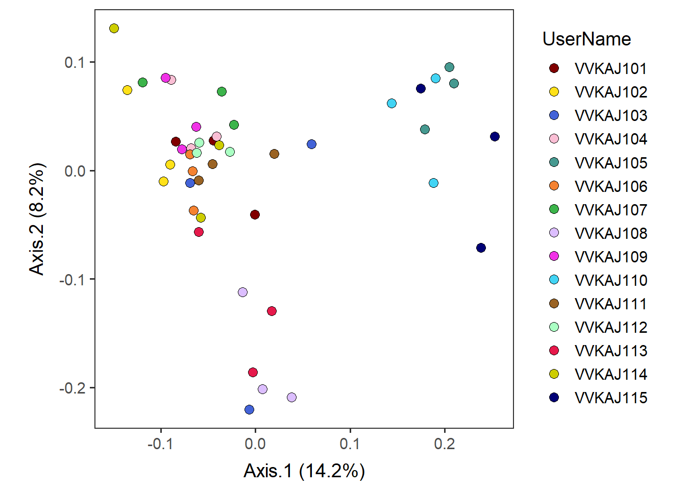
Save by_user plot as a pdf.
ggsave("Viz_Ordination/VVKAJ_Items_f_id_s_m_QCed_4Lv_ord_WEIGHTED_users_Axis12.pdf", by_user,
       device="pdf", height=5, width=7, unit="in", dpi=300)
Add lines to connect samples in the order in which they appear in the data using geom_path. [NOTE] A similar-sounding function, geom_line, connects in the order of the variable (small to large) on the x axis, so it could be misleading. We want to use geom_path here.
by_user_pathconnected <- by_user +  geom_path(aes(color = UserName)) +
                                    scale_color_manual(values=distinct100colors)
by_user_pathconnected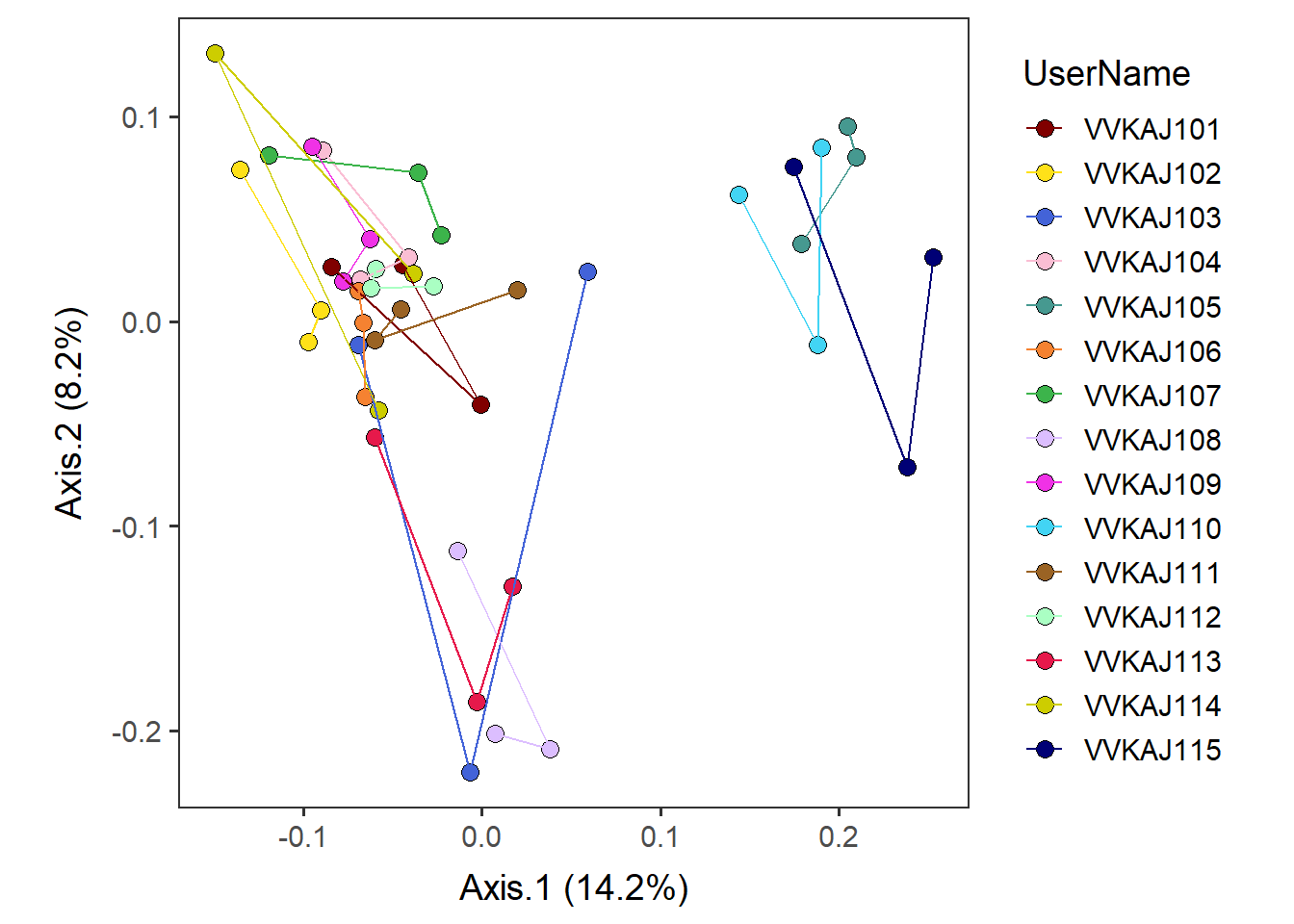
Save by_user_pathconnected as a pdf.
ggsave("Viz_Ordination/VVKAJ_Items_f_id_s_m_QCed_4Lv_ord_WEIGHTED_users_Axis12_pathconnected.pdf",
       by_user_pathconnected, device="pdf", height=5, width=7, unit="in", dpi=300)
Change the appearance of datapoints of specific user(s)
Subset datapoint(s) that you would like to highlight.Let us highlight those on keto diet: VVKAJ103, VVKAJ108, and VVKAJ113. The vertical var “|” means “or” in the subset condition.
select_point_keto <- subset(meta_usersdf, UserName=="VVKAJ103" | UserName=="VVKAJ108" | UserName=="VVKAJ113") Add selected user(s) above with a thicker outline.
highlighted <-
  by_user +
    geom_point(select_point_keto, shape=21, size=3, alpha=1, stroke=2,
               mapping=aes(x=Axis.1, y=Axis.2, fill=UserName), show.legend=F) +
    # Specify that the 3rd, 8th, and 13th datapoints will have a thicker outline (stroke=2),
    # and all others will have stroke=0.
    guides(fill=guide_legend(override.aes=list(stroke=c(0,0,2,0,0, 0,0,2,0,0, 0,0,2,0,0))))
highlighted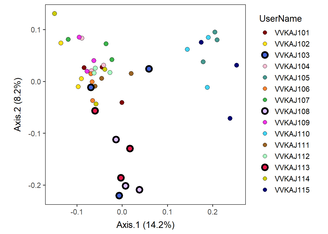
Save highlighted as a pdf.
ggsave("Viz_Ordination/VVKAJ_Items_f_id_s_m_QCed_4Lv_ord_WEIGHTED_users_Axis12_highlighted.pdf",
       highlighted, device="pdf", height=5, width=7, unit="in", dpi=300)
Come back to the main directory before you start running another script.
setwd(main_wd)